Office pages
Redesigned realtor pages on a housing platform to enhance value and usability, transforming a free feature into a premium, monetizable product.
Project Overview: Enhancing the Funda Office Page
The Office Page is a key realtor representation tool on the Funda platform. Linked from listings and search results, it helps consumers explore agents' profiles and portfolios.
- Goal:
Turn a free, exclusive feature into a paid, revenue-generating product. - Background:
Office Pages were previously available only to agents from a single national association, at no cost. - Discovery:
- Realtors from other associations expressed strong interest.
- Competing platforms offer more structured, informative office pages, including team hierarchies and richer content.
- Hypothesis:
Modernizing the Office Page to better meet agent needs—and expanding access beyond the original group—would justify a paid model. Despite some user drop-off, new adoption would drive significant revenue growth. - Outcome:
The redesigned Office Page now generates €1.8M in annual revenue.
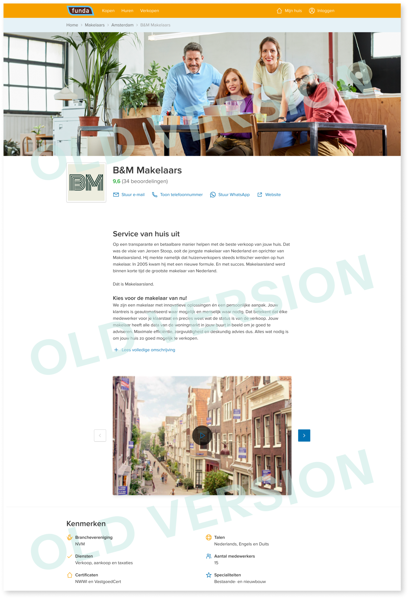
How it worked before
Redesigning the office page was chosen as one part of a three-parts plan to meet a business goal of
increasing
revenue through realtors' satisfaction (other parts being introducing an individual-agent level entity to
the
platform, and opening up upgrades to previously-underserved real estate associations).
The old narrow design included a long scroll through long descriptions, and a mishmash of component styles in random order. Working on the new design served as an opportunity to align visually and operatively with other pages on the platform for better consistency, reorganise the components to meet the agents preference and expectations, and to manage legacy code.
The old narrow design included a long scroll through long descriptions, and a mishmash of component styles in random order. Working on the new design served as an opportunity to align visually and operatively with other pages on the platform for better consistency, reorganise the components to meet the agents preference and expectations, and to manage legacy code.
User Research
The research leading up to the redesign included:
- Interviewing realtors
- Inspecting usage and traffic data of the previous pages
- Showcasing realtors own websites and competitors / peers websites
- Consulting with our own customer success representatives, marketing and sales people
- Consulting other stakeholders to get their opinion based on years of experience interacting with realtors and consumers
- Inspecting usage and traffic data of the new pages
Conclusions
Main conclusions from the extensive research showed:
- Realtors were very eager to express their brand more strongly on their pages
- Realtors consider showcasing their specific services as high priority
- Consumers require organisation of the information in a more visually appealing and easy to process design, since the pages consist of so many different types of data
Solution
The final design, that took a few rounds of reviews with peers and stakeholders included solutions for
each of the issues I set out to tackle.
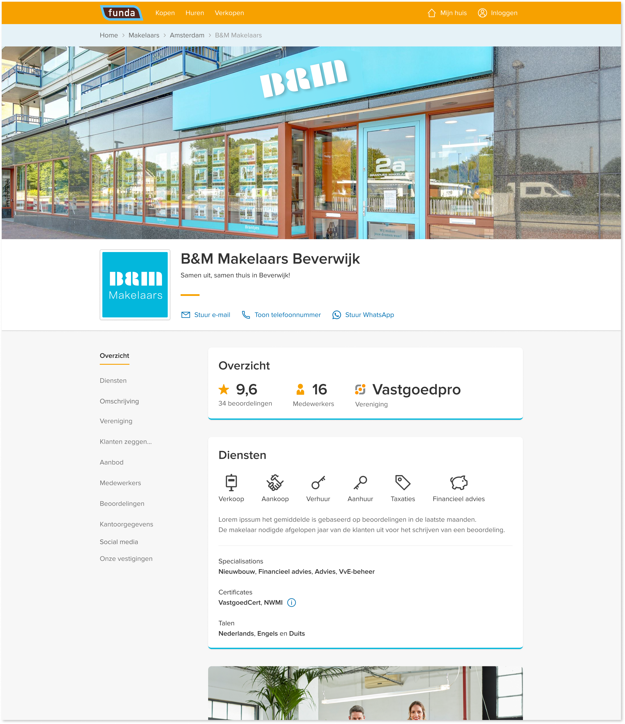
- I added an optional thin bottom outline to the cards to match the office's brand colour
- Using icons and bullets for overview, services and creditation sections to visually distinguish the components, as well as highlighting a favouring review and assocaited branches, and redesigning the exisitng components for better scanning readability and consistency.
- Adding a floating side menu to communicate the types and amount of content in the page as well as for orientation and quick navigation
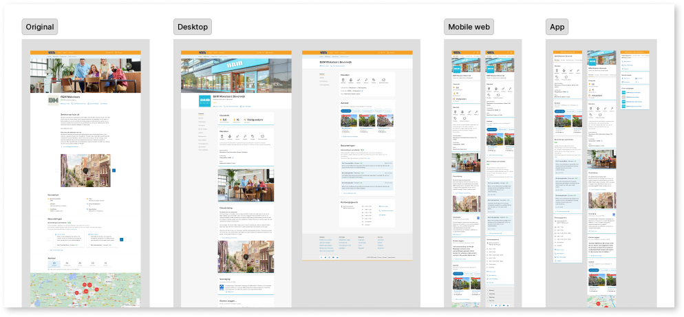
Mobile design
Navigation
Interactions
Interlinks
View an example of this feature online:
Results
With the feature now behind a paywall, some existing users opted out, but new users, previously without
access,
joined. As a result,
we maintained the same user volume, now generating €150,000 in monthly revenue.